Motion
Mental model: React owns structure, tokens own time and curves, CSS owns applicability. A component never decides how fast or whether to animate — it declares an intent (
motion="sheet"), the motion tokens resolve the timing, and media conditions (prefers-reduced-motion) filter what actually moves on this device.
The design system animates with native CSS only: enter transitions run
through @starting-style, exits through a data-state attribute contract,
and every duration and easing resolves from motion tokens exposed as CSS
custom properties. There is no animation-library payload in your bundle for
any of this.
The three tiers
Primitives — a clean duration scale and named easing curves:
| Var | Value |
|---|---|
--apollion-motion-duration-150 | 150ms (micro-interactions) |
--apollion-motion-duration-300 | 300ms (surface movement) |
--apollion-motion-easing-enter | cubic-bezier(0, 0, 0.2, 1) (decelerate — arriving) |
--apollion-motion-easing-exit | cubic-bezier(0.4, 0, 1, 1) (accelerate — leaving) |
Intents — what components actually consume, named by purpose:
micro (hover/focus feedback), enter/enterFast, exit/exitFast,
emphasis (sheets, modals, drawers), settle (slow color ease-back). Each
intent exposes a -duration and an -easing var:
.my-panel {
  transition: transform var(--apollion-motion-intent-emphasis-duration, 300ms)
    var(--apollion-motion-intent-emphasis-easing, cubic-bezier(0.2, 0, 0, 1));
}
Indicator channel — --apollion-motion-indicator-loop / -pulse, the
cycle durations of indeterminate indicators (Spinner). It is a separate
namespace on purpose: see reduced motion below.
All values live on theme.motion too; always write the theme literal as the
var() fallback so styles resolve even without the global stylesheet.
The motion prop
Every container-derived component accepts a semantic preset:
<Flex motion="slide-up">Toast body</Flex>
<BaseContainer motion="sheet">Bottom sheet panel</BaseContainer>
Vocabulary: fade, scale, slide-up/down/left/right (content-level, small
nudge + fade), collapse (height collapse — the element becomes a one-track
grid and its single child collapses), sheet, sheet-top, drawer-left,
drawer-right (surface-level, full-distance travel — sheet rises from the
bottom edge, sheet-top drops from the top), and none.
A preset emits three things: the transition over the intent vars, the
pre-enter state inside @starting-style (the browser animates the first
style application — mount animation with zero JS), and the exit state under
[data-state="closing"].
The collapse preset is what a stacked Notification toast uses to leave:
the wrapper becomes a one-track grid whose row transitions 1fr → 0fr on
close, so the siblings below reflow into the gap with zero JS or layout
measurement — no AnimatePresence, no FLIP.
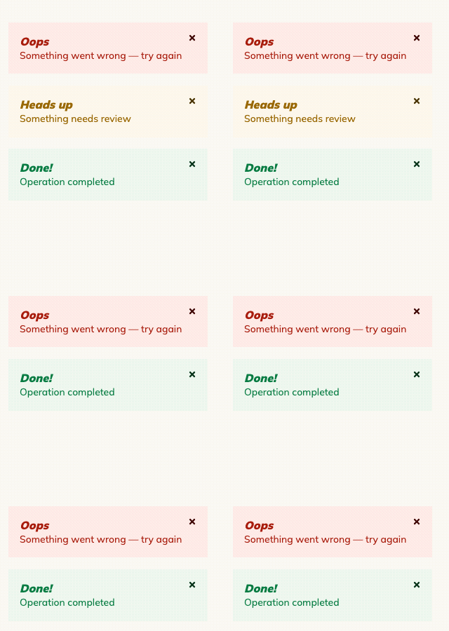
Notification toast stack — dismissing the middle item plays the collapse preset (grid-rows) on its wrapper; the remaining toasts reflow with a plain CSS transition.
Exiting the DOM
For elements that unmount (modals, toasts), pair the preset with
useExitTransition — it holds the node through the closing transition:
const { mounted, state, ref } = useExitTransition(isOpen);

return mounted ? (
  <Flex ref={ref} motion="sheet" data-state={state}>
    …
  </Flex>
) : null;
For elements that stay mounted and only toggle display/hidden, skip the
hook — native CSS already covers both directions:
.panel {
  transition:
    opacity var(--apollion-motion-intent-exit-duration, 150ms),
    display var(--apollion-motion-intent-exit-duration, 150ms) allow-discrete;
}
.panel[hidden] {
  opacity: 0;
}
@starting-style {
  .panel {
    opacity: 0;
  }
}
View transitions (opt-in)
For page-level cross-fades — a theme/mode switch, a route change — the DS ships an opt-in wiring of the browser's View Transitions API to the motion tokens. Extend the global stylesheet and wrap the state change:
import { GlobalStyle } from '@apollion-dsi/core/themes';
import { viewTransitionStyles } from '@apollion-dsi/core/themes/motion';

<GlobalStyle extend={viewTransitionStyles} />;

// e.g. an animated mode switch:
const switchMode = (next) => {
  if (document.startViewTransition) {
    document.startViewTransition(() => setMode(next));
  } else {
    setMode(next);
  }
};
The old frame leaves on the exit intent and the new one arrives on the
enter intent. Everything is guarded by @supports — browsers without the
API swap instantly (motion never blocks), and reduced motion is inherited
from the var zeroing. Whether a record opens as a modal or as a page —
and which element gets a view-transition-name — stays a routing
decision of your app, never the component library's.
Reduced motion
One global rule zeroes every duration var (scale + intents) to 0.01ms
under prefers-reduced-motion: reduce — every preset and every tokened
transition reduces automatically, nothing to remember per component. The
indicator channel is exempt: an infinite animation at near-zero cycles would
strobe, so indeterminate indicators keep a slow, steady motion and drop
their embellishments instead.
Legacy aliases
theme.animation.transitions.short / .settle remain available forever as
aliases of intent.micro / intent.settle — same numbers, now routed
through the vars. New code should consume theme.motion and the
--apollion-motion-* vars directly.
See also
useExitTransition— the exit half of the contract.- Container Queries — the slot-relative sibling channel.
- Storybook: component stories animate live; the visual-regression suite freezes motion by design.